
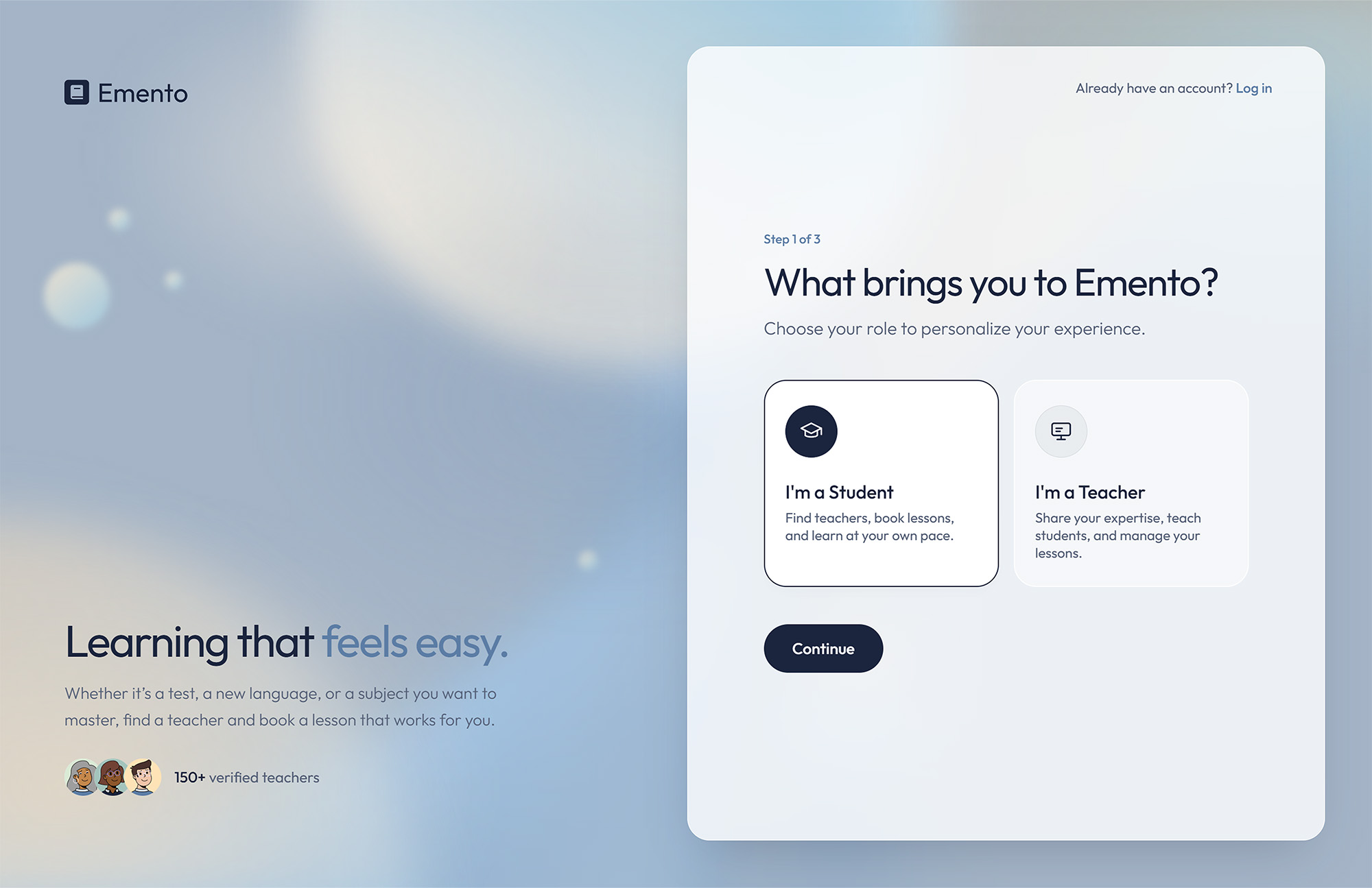
User Groups

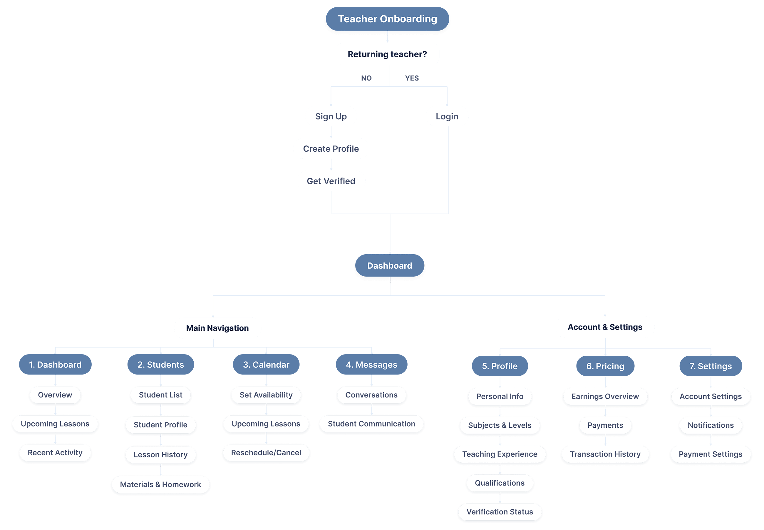
Teaches, manages availability and supports students.
Learns, discovers teachers and books lessons.

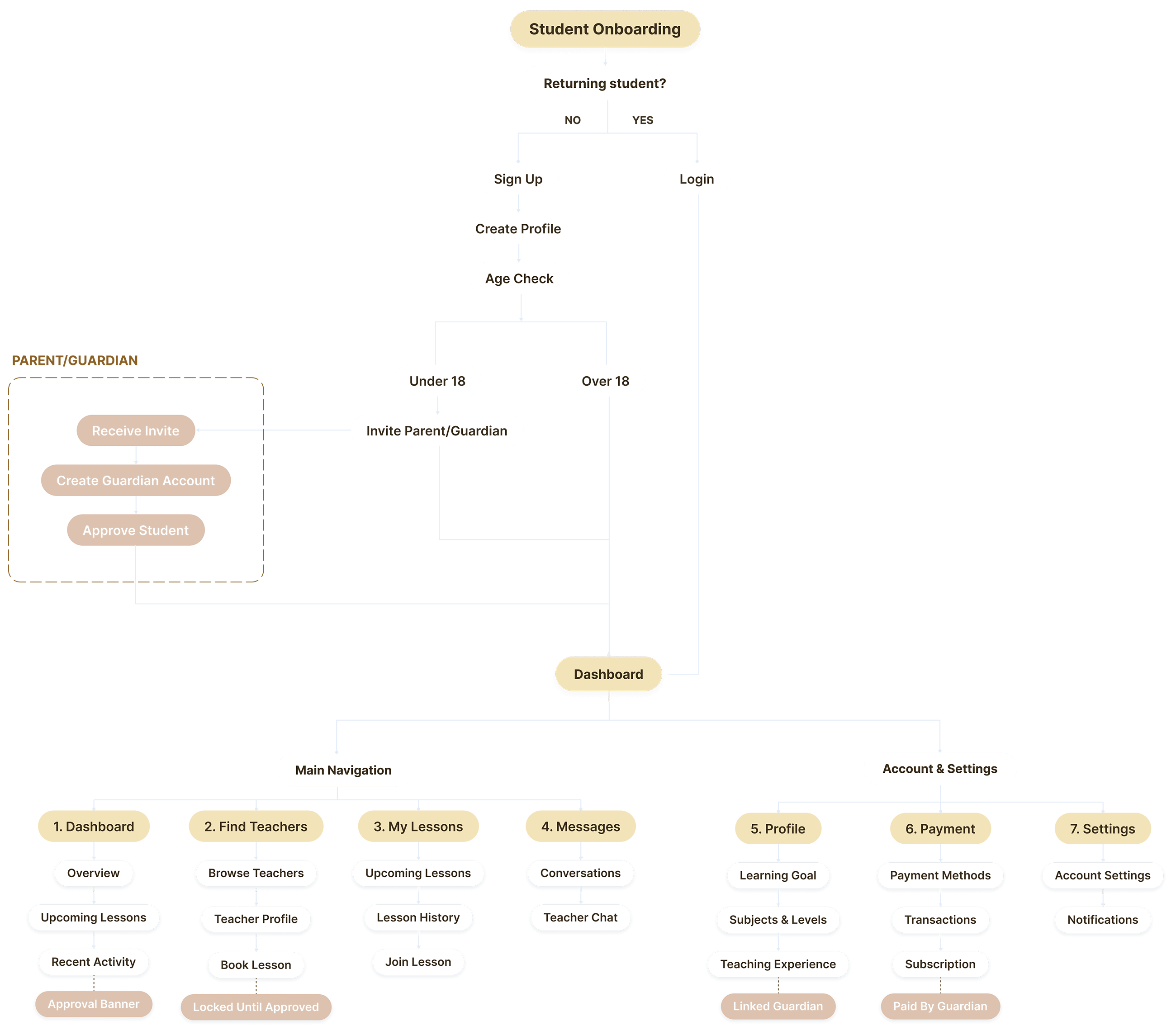
Supports underage students with payments and permissions.
Interview Insights
“Most of the time, we arrange everything through messages. It can take quite a few back-and-forths just to find a time that works.”
“When a student’s parent contacts me, they usually ask about my experience and qualifications before anything else.”
“I use one tool for video calls, another for materials, and messages for everything else. It would be much easier to have it all in one place.”
Teachers interviewed
Interview format
Average interview
Key Findings
Scheduling should be simple
Teachers often arrange their availability through messages, which can lead to a lot of back-and-forth. A simple availability and booking system could make this much easier.
Trust needs to be visible
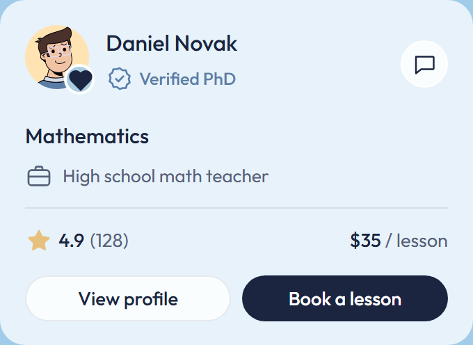
Qualifications and experience play an important role in how teachers establish credibility with new students and parents. Verification should therefore be part of the teacher profile.
Booking should feel effortless
Once a student decides to work with a teacher, the next steps should be straightforward. Clear availability, pricing and lesson details can help remove unnecessary communication before a lesson is booked.
Learning should continue after the lesson
Notes, homework and study materials are often scattered across different tools. Keeping them in one place could make it easier to continue learning between lessons.
Product Principles
Only verified teachers
Every teacher is verified by the platform before their profile becomes visible to students.
Choice through comparison
Students can compare ratings, experience, reviews, education and teaching levels to find a teacher who fits their needs.
Pricing that reflects expertise
Teachers set their own lesson prices based on their subject, level and experience.
Independent, with a safety net
Younger students can use the platform on their own, while a linked parent account approves bookings and handles payments.
Design
Typography
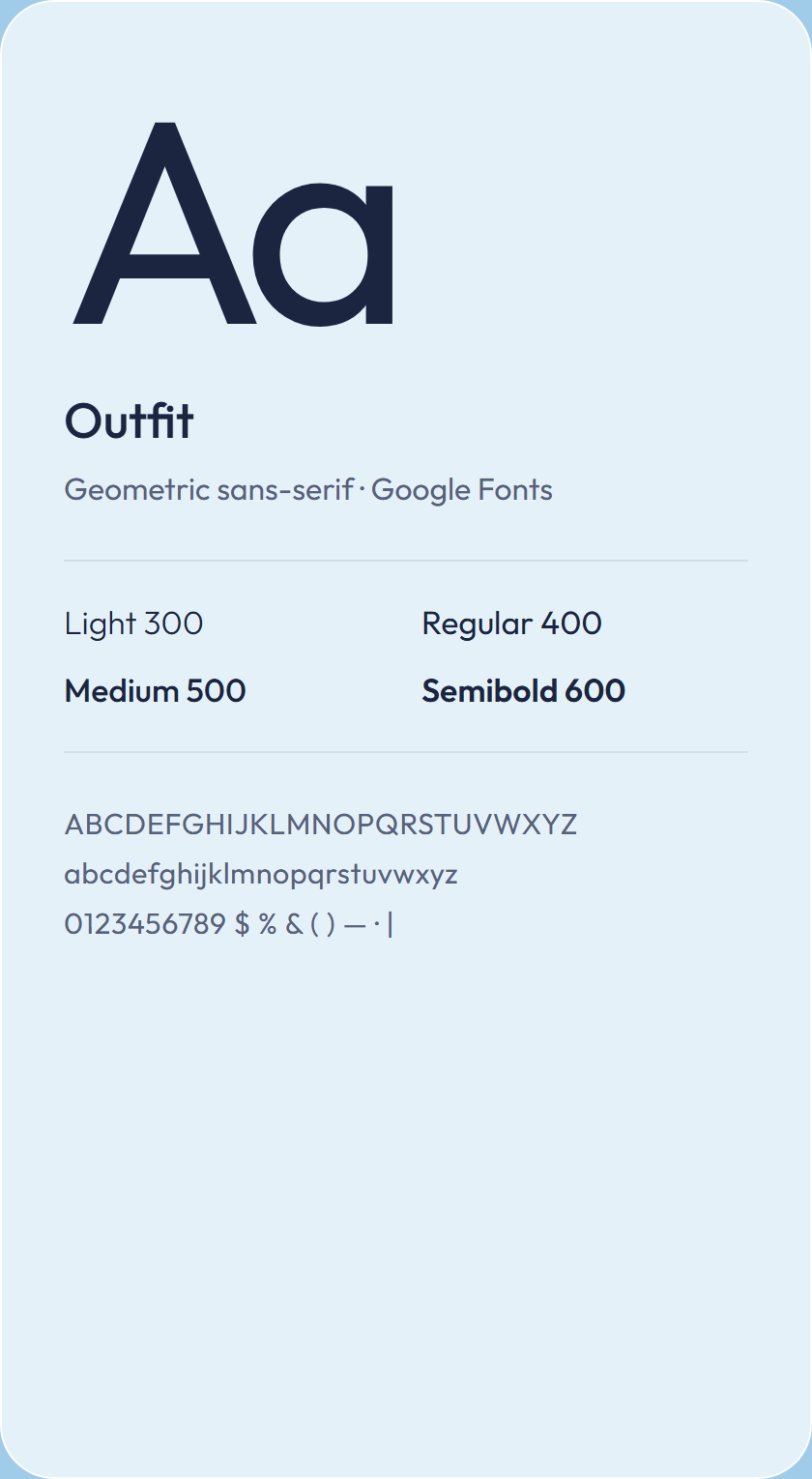
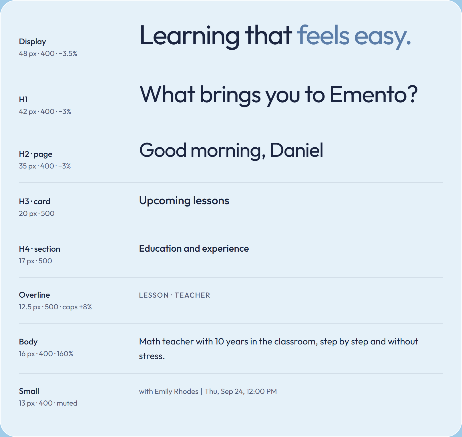
One family, Outfit, from light to semibold. Large headings stay light and tight; UI text uses medium for emphasis.
Color
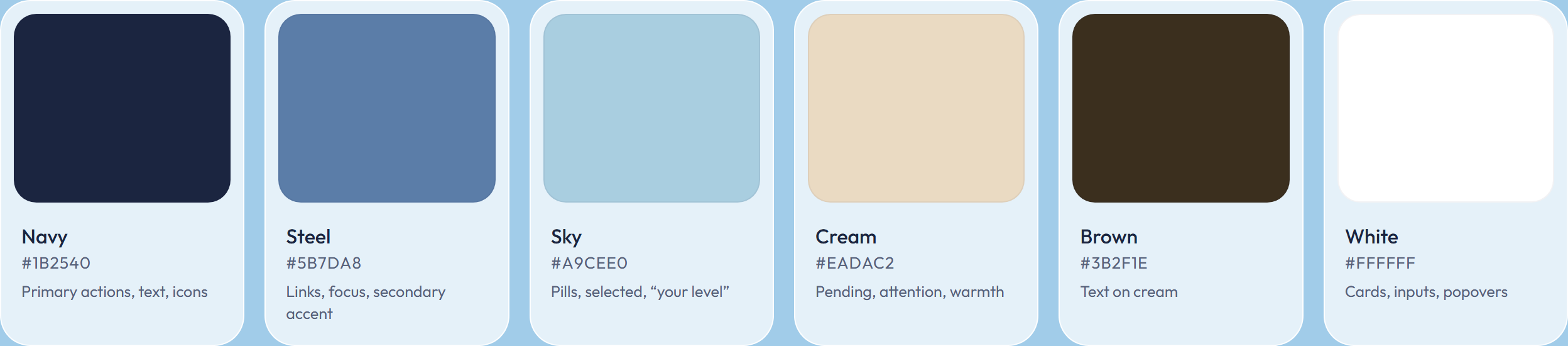
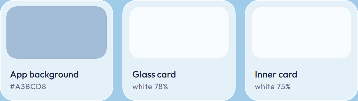
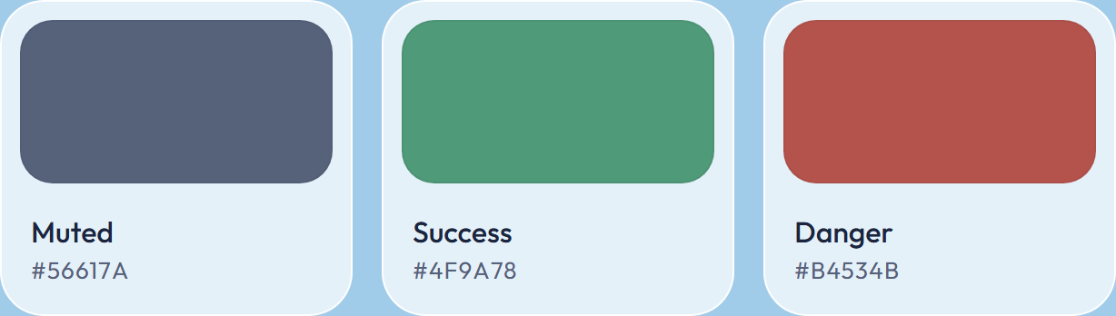
A cool, airy palette with one warm accent. Navy carries actions and text, sky and cream mark state, white glass holds content.
Buttons
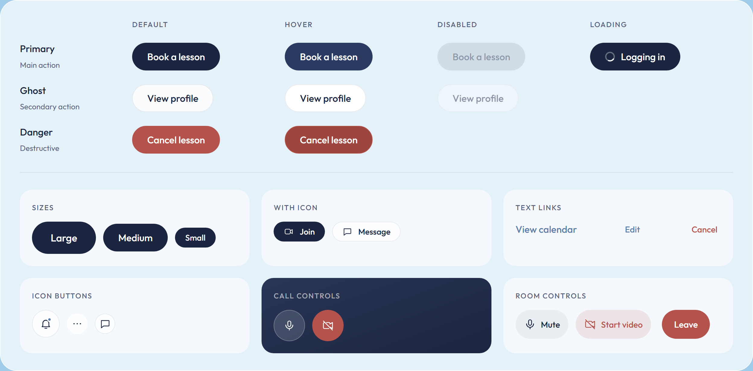
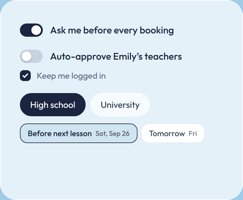
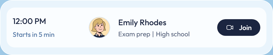
Fully rounded pills. Navy for the one main action on a screen, white glass for everything next to it. No lift on hover, only color changes.
Tags & status
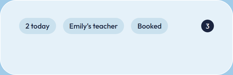
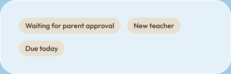
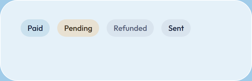
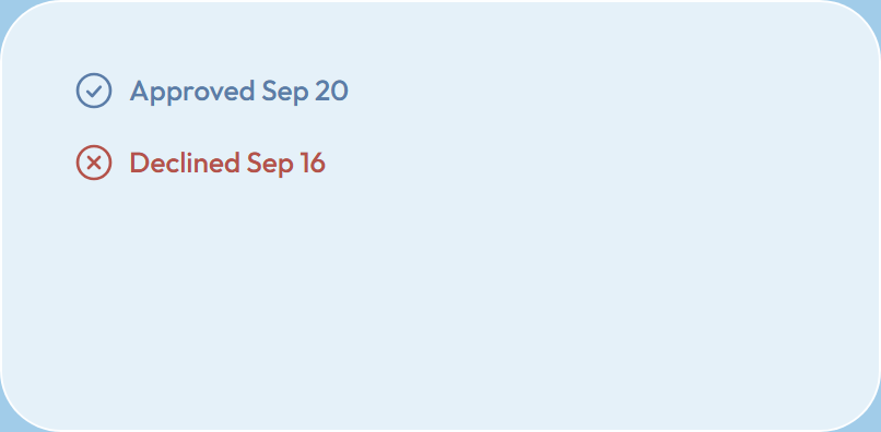
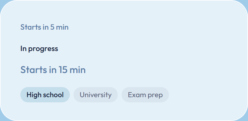
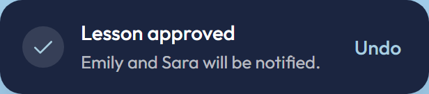
Small pills say what state something is in. Sky is neutral or positive, cream asks for attention, red is only for declined or cancelled.

Form elements
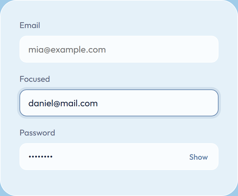
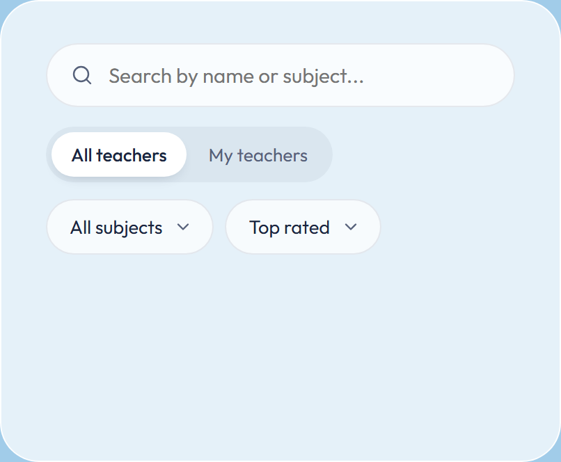
Soft white fields with a steel focus ring. Choices are made with pills, switches and custom dropdowns instead of browser defaults.
Cards
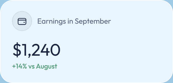
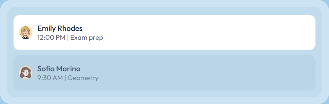
Frosted white glass on the pastel blue background, 24 px corners. Inner items sit on a lighter white with 16–18 px corners.

Avatars & icons
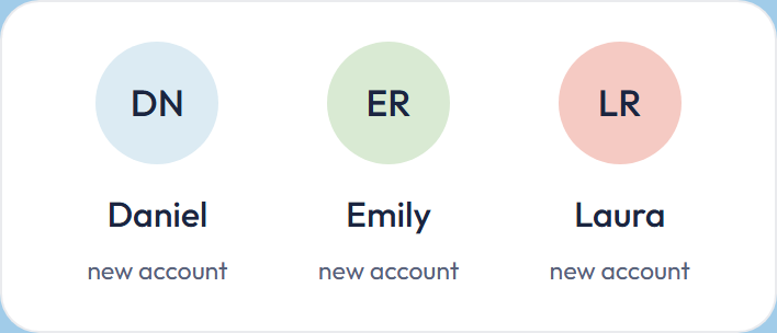
Every account starts with initials on a pastel circle — nothing is guessed about gender or looks. People then choose a photo or an illustration themselves. Icons are Lucide at a 1.6 stroke.
Initials by default
A new account shows the person's initials on one of six pastel colors. Neutral, tidy, and it works for every name.
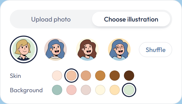
Choose a photo or illustration
From the profile: upload a photo, or pick an illustration and adjust skin tone, hair and background. The person decides how they look.
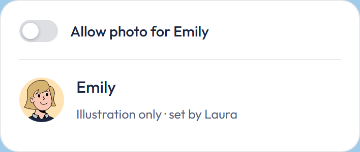
Under 18
The parent decides in Family settings whether a child may upload a photo. If not, the child keeps initials or picks an illustration.

End-to-end journey
The next three clips show the main journey through the platform from three different perspectives: student, parent and teacher. Together, they show how a lesson goes from booking to being held.